Accessible Color Picker Chrome Extension


-
Chrome Extension Page
-
Total Number of Extension users:8K +
-
Reviewed by :9 Chrome Users
-
Author Name:
-
['support@levelaccess.com', '1310 N Courthouse Rd Suite 860 Arlington, VA 22201 US', 'True', 'Level Access', 'Jim Baker', 'Level Access']
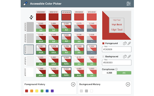
 There must be enhanced contrast between foreground and background text colors and images of text. Enhanced color contrast ensures that the page is usable by a very wide range of people with low vision and color deficiencies or when the page is viewed without color, and users of monochrome screens can understand page content.

Leverage this in-browser color picker to evaluate the accessibility of your color palette. This tool allows you to select foreground and background colors and will determine the color contrast ratio between them. If your colors do not have sufficient contrast, this tool will suggest similar colors that are compliant.

Additional features
* History of last 10 foreground and 10 background colors selected
* Preview sample text using selected colors
* Toggle foreground and background to test variations
* Editable hex codes with simple copy to clipboard button

How to install Accessible Color Picker chrome extension in chrome Browser
You can Follow the below Step By Step procedure to install the Accessible Color Picker Chrome Extension to your Chrome Web browser.
- Step 1: Go to the Chrome webstore https://chrome.google.com/webstore or download the extension Accessible Color Picker Chrome Extension Download from https://pluginsaddonsextensions.com
- Step 2: Now search for the Accessible Color Picker in Chrome Webstore Search and click on the search button.
- Step 3: click on the Accessible Color Picker Chrome Extension Link
- Step 4: in the next page click on the Add to Chrome button to Download and Install the Accessible Color Picker extension for your Chrome Web browser .
Accessible Color Picker Chrome extension Download
Looking for a method to Accessible Color Picker Download for Chrome then this download link is for you.It is the Accessible Color Picker Chrome extension download link you can download and install Chrome Browser.
Download Accessible Color Picker chrome extension (CRX)
-
Evaluate web accessibility within your browser.
-
Continuum Explorer is the simplest way for developers to write beautiful and accessible code. Download this browser extension to…
-
A web browser extension for checking accessibility issues
-
Check the contrast between different colour combinations against WCAG standards
-
Accessibility testing tool from TPGi
-
Accessibility Insights for Web helps developers quickly find and fix accessibility issues.
-
Displays ARIA used in web technologies, includes live region, and widget roles, proper nesting and focus management.
-
To show, browse and audit (for accessibility and SEO) the headings structure
-
To check the color contrast between foreground and background of the texts
-
Search for the perfect color via an stylish color picker in a popup window.