Chrome //
Extensions
Chrome //
Extensions  Chrome
Web store
Chrome
Web store Viewport Resizer – Responsive Testing Tool Chrome Extension


-
Chrome Extension Page
-
Total Number of Extension users:90K +
-
Reviewed by :265 Chrome Users
-
Author Name:
-
['io@maltewassermann.com', 'True', 'Malte Wassermann']
 Viewport Resizer is a tool to test any website’s responsiveness. Just install the extension, go to the page you want to test and check all kinds of screen resolutions of the page.

The smartest way to share your defined environment of devices and breakpoints directly with your team and client.

This tool should not replace a real device simulation. It rather helps you, your team and client testing statuses, transitions, text length etc. throughout different device types.

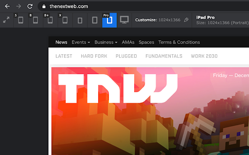

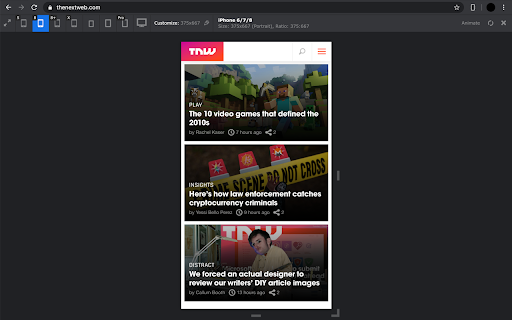
How to install Viewport Resizer – Responsive Testing Tool chrome extension in chrome Browser
You can Follow the below Step By Step procedure to install the Viewport Resizer – Responsive Testing Tool Chrome Extension to your Chrome Web browser.
- Step 1: Go to the Chrome webstore https://chrome.google.com/webstore or download the extension Viewport Resizer – Responsive Testing Tool Chrome Extension Download from https://pluginsaddonsextensions.com
- Step 2: Now search for the Viewport Resizer – Responsive Testing Tool in Chrome Webstore Search and click on the search button.
- Step 3: click on the Viewport Resizer – Responsive Testing Tool Chrome Extension Link
- Step 4: in the next page click on the Add to Chrome button to Download and Install the Viewport Resizer – Responsive Testing Tool extension for your Chrome Web browser .
Viewport Resizer – Responsive Testing Tool Chrome extension Download
Looking for a method to Viewport Resizer – Responsive Testing Tool Download for Chrome then this download link is for you.It is the Viewport Resizer – Responsive Testing Tool Chrome extension download link you can download and install Chrome Browser.
Download Viewport Resizer – Responsive Testing Tool chrome extension (CRX)
-
A tool for designers to measure screen dimensions
-
Instantly translate sentences and look up words on website. Just by a mouse click or a 'key'press.
-
Open source browser design tools
-
Fast and easy way to test your responsive design in multiple viewports
-
Making responsive design a little bit easier.
-
Show multiple screens once, Responsive design tester
-
Measure page elements size in pixel with an easy-to-use ruler.
-
This extension displays Chrome’s viewport dimensions when resizing the browser window.
-
Determines browser window width and which bootstrap viewport is in use.
-
Resize the browser window to emulate various screen resolutions.