 Chrome //
Extensions
Chrome //
Extensions  Chrome
Web store
Chrome
Web store Breakpoint Chrome Extension


-
Chrome Extension Page
-
Total Number of Extension users:1K +
-
Reviewed by :31 Chrome Users
-
Author Name:
-
['True', 'Filip Johansson']
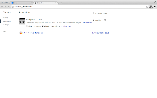
 Breakpoint lets you use your keyboard to resize your browser window - one pixel at a time. Therefore it is the perfect companion when you are trying to find the exact pixel where your responsive websites break.

How to use
These are the default settings, you can change them in 'Window' > 'Extensions', then scroll down to the bottom and to the right you will find 'Keyboard Shortcuts'.
Please note: Since Chrome version 29 these are not set by default anymore! You now have to set them manually when you install the extension.

Alt + Left Arrow: Decrease the width of the window by 1px
Alt + Right Arrow: Increase the width of the window by 1px
(Add Shift to any of the combinations to change it by 10px)

Breakpoint also has the ability to change the height of the browser window, but you have to manually activate it in 'Window' > 'Extensions' > 'Keyboard Shortcuts'.

When you find the break point you are looking for the tiny icon in the toolbar will tell you the exact size of you browser window.

How to install Breakpoint chrome extension in chrome Browser
You can Follow the below Step By Step procedure to install the Breakpoint Chrome Extension to your Chrome Web browser.
- Step 1: Go to the Chrome webstore https://chrome.google.com/webstore or download the extension Breakpoint Chrome Extension Download from https://pluginsaddonsextensions.com
- Step 2: Now search for the Breakpoint in Chrome Webstore Search and click on the search button.
- Step 3: click on the Breakpoint Chrome Extension Link
- Step 4: in the next page click on the Add to Chrome button to Download and Install the Breakpoint extension for your Chrome Web browser .
Breakpoint Chrome extension Download
Looking for a method to Breakpoint Download for Chrome then this download link is for you.It is the Breakpoint Chrome extension download link you can download and install Chrome Browser.
Download Breakpoint chrome extension (CRX)
-
Responsive Inspector Reloaded allows inspecting page media queries. Same as original, but it works on modern browsers.
-
Making responsive design a little bit easier.
-
This extension displays Chrome’s viewport dimensions when resizing the browser window.
-
Calculate screen size and resolution.
-
Viewport detector for bootstrap 3
-
Responsive design testing tool to test any website’s responsiveness – it only takes 2 seconds! Emulate various screen resolutions.
-
Resize the browser window to emulate various screen resolutions.
-
Interactively see how a website's layout changes responsively
-
Fast and easy way to test your responsive design in multiple viewports
-
Test responsive design of any web page with one click. Extension works when you click to extension icon only.