 Chrome //
Extensions
Chrome //
Extensions  Chrome
Web store
Chrome
Web store Responsive View Chrome Extension


-
Chrome Extension Page
-
Total Number of Extension users:1K +
-
Reviewed by :14 Chrome Users
-
Author Name:
-
['True', 'Aneeta Kolhe']
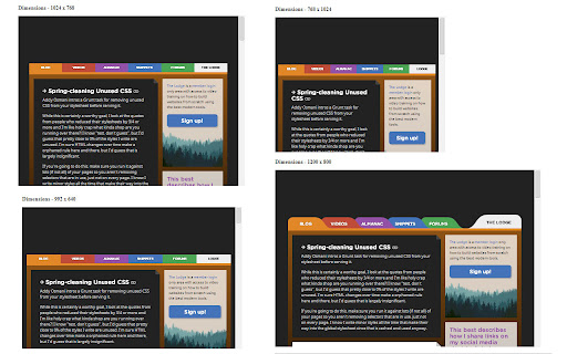
 This extension gives you an ability to view the page in different screen sizes, just by a click.

HOW TO USE: Go to the page that you want to view in different screen sizes. Click on the extension icon and scroll vertically.


Various screens sizes that are available as follows:
1. 340 x 480 - Mobile
2. 480 x 640 - Mobile (larger screen)
3. 768 x 1024 - Tablet (Portrait)
4. 1024 x 768 - Tablet (Landscape)
5. 992 x 640 - Bootstrap
6. 1200 x 800 - Desktop


How to install Responsive View chrome extension in chrome Browser
You can Follow the below Step By Step procedure to install the Responsive View Chrome Extension to your Chrome Web browser.
- Step 1: Go to the Chrome webstore https://chrome.google.com/webstore or download the extension Responsive View Chrome Extension Download from https://pluginsaddonsextensions.com
- Step 2: Now search for the Responsive View in Chrome Webstore Search and click on the search button.
- Step 3: click on the Responsive View Chrome Extension Link
- Step 4: in the next page click on the Add to Chrome button to Download and Install the Responsive View extension for your Chrome Web browser .
Responsive View Chrome extension Download
Looking for a method to Responsive View Download for Chrome then this download link is for you.It is the Responsive View Chrome extension download link you can download and install Chrome Browser.
Download Responsive View chrome extension (CRX)
-
Responsive Inspector Reloaded allows inspecting page media queries. Same as original, but it works on modern browsers.
-
Making responsive design a little bit easier.
-
Test your websites responsivness
-
Show multiple screens once, Responsive design tester
-
Listens for changes to a DOM node attribute in a page and sets the browser's useragent according to the contents of that attribute.
-
Responsive design testing tool to test any website’s responsiveness – it only takes 2 seconds! Emulate various screen resolutions.
-
Interactively see how a website's layout changes responsively
-
Fast and easy way to test your responsive design in multiple viewports
-
Make all web pages display as they would on a mobile device
-
Test responsive design of any web page with one click. Extension works when you click to extension icon only.