 Chrome //
Extensions
Chrome //
Extensions  Chrome
Web store
Chrome
Web store Flexer Chrome Extension


-
Chrome Extension Page
-
Total Number of Extension users:226 +
-
Reviewed by :5 Chrome Users
-
Author Name:
-
['True', 'Derek Story']
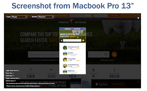
 Flexer provides efficient mobile/responsive web testing for web developers. Quickly navigate through options using quick commands to free yourself from clicking through an array of options. Flexer accurately emulates the most popular mobile devices on the market.

Flexer allows you to instantly resize the viewport/window without the need to touch your mouse. You get a mobile browser at the touch of a button.

Instructions:

1. Install
2. Enable Flexer for a site domain by right clicking on the site page and choosing 'Add Domain' under the Flexer options.
3. Reload the page and hit M (be sure nothing on the page is in focus. example: textbox)  to open/close the Flexer mobile viewer. (Or open from the right-click context menu)
4. You should now be in the mobile mode.


Quick Commands:

Toggle Mobile Viewer: M
Phone View: J
Tablet View: K
Toggle Landscape View: L
Refresh Viewer: R


For feature request, bug reports or general comments, please use the support tab or email me directly at:
derek.a.story@gmail.com


How to install Flexer chrome extension in chrome Browser
You can Follow the below Step By Step procedure to install the Flexer Chrome Extension to your Chrome Web browser.
- Step 1: Go to the Chrome webstore https://chrome.google.com/webstore or download the extension Flexer Chrome Extension Download from https://pluginsaddonsextensions.com
- Step 2: Now search for the Flexer in Chrome Webstore Search and click on the search button.
- Step 3: click on the Flexer Chrome Extension Link
- Step 4: in the next page click on the Add to Chrome button to Download and Install the Flexer extension for your Chrome Web browser .
Flexer Chrome extension Download
Looking for a method to Flexer Download for Chrome then this download link is for you.It is the Flexer Chrome extension download link you can download and install Chrome Browser.
Download Flexer chrome extension (CRX)
-
Test responsive web designs or mobile pages and see if it is mobile friendly
-
Making responsive design a little bit easier.
-
Listens for changes to a DOM node attribute in a page and sets the browser's useragent according to the contents of that attribute.
-
View current page in the mobile-friendly format by spoofing Android or iOS user-agent string on request header and JavaScript sides
-
Fast and easy way to test your responsive design in multiple viewports
-
Switch to mobile view with one click via toolbar button.
-
Test responsive design of any web page with one click. Extension works when you click to extension icon only.
-
To view the page in different device screen sizes, just by a click