 Chrome //
Extensions
Chrome //
Extensions  Chrome
Web store
Chrome
Web store Mobile View Switcher Chrome Extension


-
Chrome Extension Page
-
Total Number of Extension users:100K +
-
Reviewed by :97 Chrome Users
-
Author Name:
-
['benni.es@yahoo.com', 'Benni']
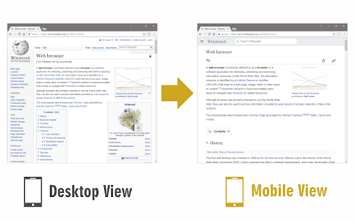
 Mobile View Switcher is a lite extension that let you switch a website to mobile view. Default mobile view is iPhone with iOS 15 but you can change it from the options page.

Simply add a desired user-agent to change the mobile view to your desired one. There are many websites that offer user-agent strings for various devices. Simply copy and paste the desired one in the designated area in options page. Then reload any website to see the mobile view UI (while the addon is active).

Toolbar button serves as ON|OFF switch to enable or disable the addon. Grey color for toolbar icon is when the addon is inactive and yellow color is for the active state. Simply click on the toolbar icon to switch states.

To report bugs, please fill the bug report form in the addons homepage (https://mybrowseraddon.com/mobile-view-switcher.html).

How to install Mobile View Switcher chrome extension in chrome Browser
You can Follow the below Step By Step procedure to install the Mobile View Switcher Chrome Extension to your Chrome Web browser.
- Step 1: Go to the Chrome webstore https://chrome.google.com/webstore or download the extension Mobile View Switcher Chrome Extension Download from https://pluginsaddonsextensions.com
- Step 2: Now search for the Mobile View Switcher in Chrome Webstore Search and click on the search button.
- Step 3: click on the Mobile View Switcher Chrome Extension Link
- Step 4: in the next page click on the Add to Chrome button to Download and Install the Mobile View Switcher extension for your Chrome Web browser .
Mobile View Switcher Chrome extension Download
Looking for a method to Mobile View Switcher Download for Chrome then this download link is for you.It is the Mobile View Switcher Chrome extension download link you can download and install Chrome Browser.
Download Mobile View Switcher chrome extension (CRX)
-
Smartphone and tablet simulator on computer with several models to test mobile responsive websites.
-
Show multiple screens once, Responsive design tester
-
Listens for changes to a DOM node attribute in a page and sets the browser's useragent according to the contents of that attribute.
-
Responsive design testing tool to test any website’s responsiveness – it only takes 2 seconds! Emulate various screen resolutions.
-
View current page in the mobile-friendly format by spoofing Android or iOS user-agent string on request header and JavaScript sides
-
Mobile/Responsive Web Testing for Front-End Web Developers
-
Automatically complete your Bing searches to earn Microsoft Rewards points.
-
Make all web pages display as they would on a mobile device
-
To view the page in different device screen sizes, just by a click
-
All-in-one tools for website migration project, operating website and SEO tools.